Saturday, April 28, 2012

Sagrada Familia

I am in Barcelona Spain this week about to head to Rome. I was able to go inside Antonio Gaudis La Sagrada Familia and wanted to share a photo with you all. This is such an incredible work of architecture it took my breath away when I entered.

Although the architectural style is considered Modernisme, Gaudi used a combination of Gothic and Art Nouveau to create this unique cathedral. From the distance this it may resemble a "drip" sand castle the detailing is incredibly ornate. The project began in 1882 and is still under construction. It is not expected to be completed for 80 or more years.

I highly recommend visiting when you are in Barcelona. I will try to post more photos along my trip but have mostly been tying to relax and enjoy the amazing sights and foods.

Thanks for stopping by!

Wednesday, March 14, 2012

Exciting News


Please excuse my absence over the past few weeks. I received some very exciting news and am jumping with joy! I was offered an amazing job at an architecture firm where I will be a full time interior designer. I will still try to share design tips and inspiration when I find time and I invite you all to follow me on Pinterest!

Thank you for all of your continued support!

Monday, March 5, 2012

House Tour: Lake Martin

Please excuse my absence for the past week. Today I was so excited to share this home with you. Designed by Tracery Interiors on Lake Martin, Alabama. This is the second home on Lake Martin that I have shown on my blog and I am thinking I might need to go for a visit! It really must be stunning there!

The family that lives in this grand home, situated on a prominent point at Lake Martin, wanted a lake house where they could relax away from their busy lives in Birmingham and gather their friends and family. Inside the home, reclaimed timbers frame a central living space with dramatic windows overlooking the lake. French antiques are paired with raw wood and galvanized metal to create an aesthetic that’s light, airy and unexpected. The use of a similar color palette from room to room creates continuity throughout the large home.

Atlanta Homes Magazine

Modern touches of linen and galvanized metal soften stately French antiques, while dividing the living room into intimate seating areas makes it feel at once cozy and grand. Moored by striking architectural details like the substantial fireplace and natural stone pillars, the space also has playful touches, like graceful chandeliers in unexpected places, keeping it light and unconventional.
Tracery Interiors


Atlanta Homes Magazine
I love the architectural details of this home, the structural stone columns and wood beams juxtapose with the soft linens, neutral palette and the antique chandeliers.
Atlanta Homes Magazine

Tracery Interiors
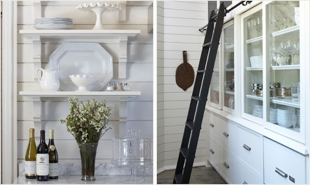
The casual vibe continues into the kitchen, where small appliances and plenty of extra storage are tucked away in a back pantry. What a brilliant idea to use a sliding ladder to access the top cupboards and the black and white color palette gives a modern touch to the rustic charm of this home.

Atlanta Homes Magazine
Offset by the natural wood and white color palette, these possibilities include modern details, like two marble-topped islands anchoring the room, a large farmhouse sink and open shelving
Atlanta Homes Magazine

Tracery Interiors

Tracery Interiors

Tracery Interiors
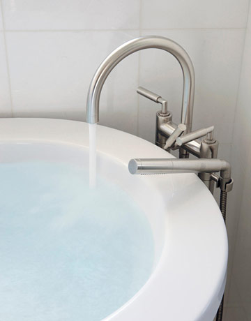
What an incredible bathtub!
Gorgeous hexagon tiles line the floor and neutral subway tiles on the walls and ceiling.
Atlanta Homes Magazine

Atlanta Homes Magazine
 Another gorgeous tub with an incredible view!
Tracery Interiors

Tracery Interiors
 What a magnificent and stately headboard!
Atlanta Homes Magazine
Love the mirror above the bed, it is the same mirror I chose for my clients guest room!
Photos will be posted soon.
Tracery Interiors

Tracery Interiors
Tracery Interiors

Enjoy!

Friday, February 24, 2012

Re-Imagine: Your Bathroom

The bathroom is one of the busiest rooms in a home and because of this it is important for the bathroom to be comfortable, clean and organized. Even a tiny powder room can be well organized. I instantly fell in love with the bathroom in the images below after seeing it in House Beautiful! Here are a few tips for a gorgeous bathroom that are often overlooked:

I have always loved natural light in a bathroom, nothing is better than soaking in the tub and looking out at the stars! Use a thin roman shade on the window for privacy. Consider adding a ceramic garden stool or small bench to set a drink or magazine.


This bathroom is spacious and has everything you could possibly need. Marble tiles line the walls of the bathroom for a grand aesthetic as well as convenience to keep clean. The band of blue glass mosaic tiles wraps around the perimeter of the space giving the feeling of being underwater. If using paint on the walls make sure you use mildew resistant paint and install an efficient fan!


When choosing materials for use in your bathroom consider these first: 
Can it get wet? For instance wood is not the best choice for a bathroom because it can mold.
How does the product handle water? If you want large stone slabs make sure they are honed or choose smaller tiles for added grout lines and therefore better slip resistance.


Think about the fixtures in your home. Do you use dark bronze or brushed nickle? 
I think it is perfectly fine to mix metal accessories in interior decor, however I try to coordinate metals for fixtures in the bathroom and kitchen.

If you want your bathroom to feel like a spa consider adding unique 
touches such as a large soaking tub, a teak wood bath caddy and luxe over sized cotton towels.


Consider a rain shower over head and built in features that make your shower enclosure feel custom, when you have a dedicated place to set shampoo and soap clutter can be cleared once and for all.


A band of glass tiles can be an inexpensive way to add color or pattern to your shower. 
Small bathrooms or powder rooms are the perfect opportunity to use the highest quality products.
(You may only need 10sqft of carrara marble tiles to cover the floor, making luxury affordable.)


 To determine what type of vanity you need think about who will be using the space. 
How will you be using the space and what items you need storage for. Are drawers or shelves better? Open or closed storage? Vanities can be built-in or free-standing, you can even use an antique dresser or sideboard. Proper lighting in the bathroom is also important, layer lighting from overhead ambient lights to task lighting near the mirror and in the shower surround.


This vanity is free-standing and has good open and closed storage, drawer dividers can be used to organize toiletries. The open shelf below the sink is a convenient place to store towels.


When choosing a mirror make sure that it will not rust or get mildew from steam. A simple and elegant beveled glass mirror can be a great choice adding a bit of feminine detail.


Make sure you have hooks or towel bars so that towels don't end up all over the floor 
and if you have the space add a designated place for a laundry hamper.

 All images courtesy of House Beautiful.

Often overlooked, these tips can provide an easy update for your master bath or powder room.
Cheers to a wonderful weekend!

Thursday, February 23, 2012

Look That I am Loving...

Lately I have seen so many gorgeous photos of dark walls and am absolutely loving the look. When choosing paint schemes for clients I often select lighter colors to make the space feel lighter, brighter and larger. However I think that deep, rich tones can dramatically change the look of a space and should not be overlooked when redesigning your home.


One of my favorite rich charcoal grays: Farrow & Ball Off Black No. 57


Happy Thursday!

Monday, February 20, 2012

Home Tour: Alice Lane Private Residence

I found this home last year while searching for design inspiration and am so happy to share it with you today. Designed by Alice Lane as a private residence in Provo, Utah. The exterior resembles a palace and the interior is nothing short of royal. This residence has "14,000 elegantly detailed square feet". The pale aqua trim contrasts with the neutral stone siding and sets the stage for the interior color scheme. The round dormer windows are picturesque, I can only imagine the view from inside!

This is such a gorgeous entry, I love the rounded ceiling and that amazing door.


The sweeping staircase is made of finely-crafted patina rails. The wood floors in the dining area were set in a chevron pattern which is an unexpected and unique detail.


Rather than painting the walls a dark color and the trim white they left the walls white and stained wood for the moulding and details. I think this is a great way to showcase the beautiful wood grain.


The wood ceiling and large beams mix beautifully with the casual linen furniture and the fireplace is perfect scale and aesthetic for the space, I love it!


A large kitchen island can add work space in the kitchen as well as a casual place to dine. 

The kitchen has an over sized apron front farm sink. I Love the tile back splash that goes up the walls to the tops of the cabinets.
Open shelves are a great way to display pretty dishware. The designers coordinated the colors of the tile with the colors of the dishware, these are the details that make up a gorgeous design.

A mixture of gilded golds, patina metals and dark bronze make up a ensemble of
natural metals in the space and contrast well with the soft linens and pale blue tones.


The details are extraordinary!


All photos courtesy of Alice Lane.

Thank you for stopping by today don't forget to follow me on Pinterest, join my blog using a Google or Gmail account, or post your comments and feedback under each blog post. I love to hear what you have to say! Thank you for all of the continued support...